The Visual Language of Sphere Corporation
Exploring the visual identity of Sphere Corporation in the 1970s, from branding to hardware, and its uncanny typographic connection to the Altair.
Sphere Corporation (1975-1977) had a distinct brand, but their products deployed an uneven visual language. I'll explore some aesthetics of Sphere's branding and hardware, and discuss what it means in the context of marketing friendliness.
Sphere Branding
Sphere Corporation was founded in early 1975 by Mike Wise of Bountiful, Utah. The name of the company came from an aspiration to do everything, to contain all possibilities, with their computer products.
An initial wordmark appeared by June of that year, consisting of the all-caps word SPHERE, set in Century Nova, overlaid onto a halftone screen gradient:

Like much graphic design work of this era, it’s likely that this was hand-made using dry-transfer lettering and effects.
A few months later, by the time their computers were actually shipping, the finalized corporate branding appeared.
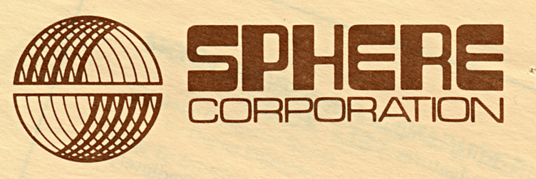
The logo is a nice bit of 1970s design, depicting a stylized dimensional “sphere” split into upper and lower hemispheres. By avoiding horizontal “latitudes,” the illustration conveys a sphere without suggesting “Earth.” The strokes of the mark are too delicate though, creating fine details that readily smudge together or disappear when reproduced at small sizes.
The word “SPHERE” here uses a distinct "high tech" typeface distributed under the name “Program” by the graphic design aide company Formatt. Similar in spirit to dry-transfer Letraset sheets, Formatt sold a line of cut-out adhesive acetate lettering in a range of typefaces for use in design work.
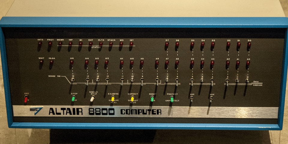
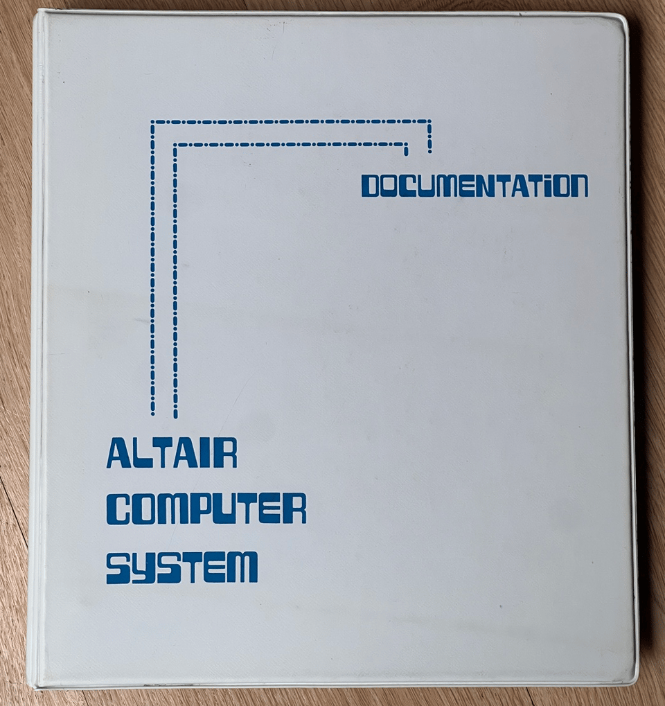
Somewhat surprising is that this is the very same typeface that was already in use by MITS for their Altair 8800! It appears extensively on both Altair computer nameplates and accompanying documentation. “Program” is a unicase style but includes alternates for many of the letters, which may be why Sphere’s usage (limited to the five letterforms in the wordmark) avoids immediately recalling the MITS branding.
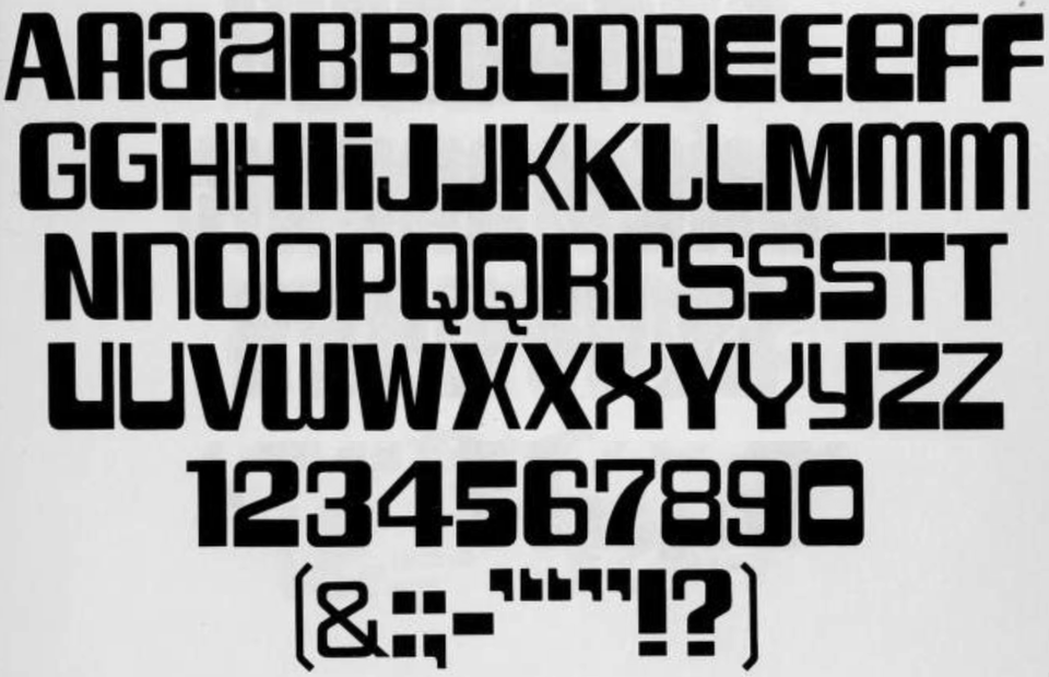
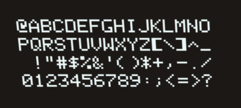
Here is a full character set for this typeface, as cataloged by type revivalist Dan X. Solo a few years later under the name “Tuxedo”:
The circumstances of the Altair parallel are unknown. At the time the Sphere logo was created, the Altair was renowned as the first and most successful microcomputer in the small hobbyist world—and its design was distinctive! Anyone working at Sphere would have been well aware of the Altair. Perhaps it was a strange sort of homage, a way to say "we're in this new arena together." Or maybe a subtle effort to benefit from a bit of MITS's brand halo. But I think it's more likely just an absurd coincidence: I can imagine Wise just commissioning a design from someone local. That designer might have no industry context, but would have an up-to-date type catalog at hand and might select an interesting new “high tech” font. Nothing says “1975” quite like this lettering! (I guess the question in the title of this piece is rhetorical, I don't know what the real answer is, sorry!)
Anyway, Sphere wisely restricted the use of “Program” to the word mark only, and chose a coherent set of letter alternates for it. This typeface is hard to control; MITS probably overused it.
The secondary word “CORPORATION” is set in a close-tracked Microgramma, the midcentury Italian sans serif that (along with its near-identical successor Eurostile) was everywhere in the 1970s and was often used to signify "the future."
The design is sharper than what most startup microcomputer companies were coming up with. (Compare with Apple's unwieldy first logo, or IMSAI's slab of vanilla Helvetica.) The full logo mark appeared prominently in magazine advertisements of the era and suggested a professionalism and even global reach that the company aspired to, though ultimately struggled with.
The Computer
Strangely, the distinctive logo did not appear on the Sphere computer itself!
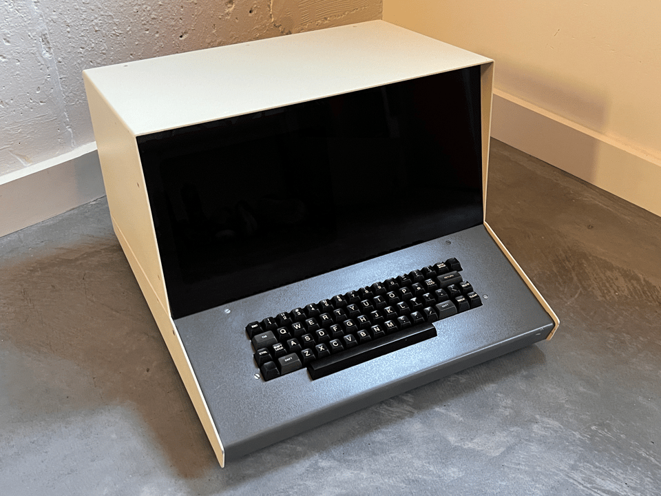
Sphere sold a painted sheet-metal case for their computers, which were fully integrated with CRT display and keyboard built in. (Not all customers bothered with this full setup– the company sold many kits of individual board sets, but the enclosure is what’s pictured in all of their marketing.) The case was not fancy, and was outsourced to a local Salt Lake City sheet metal shop. The basic shape was similar to many video terminals of the time, and it would be easy then (as now) to mistake a Sphere computer for one more of those.
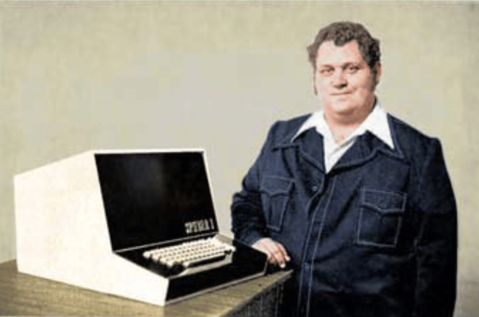
The casing has a soupçon of pizzazz: a smoked acrylic panel covers the display portion on the front, blanking out the edges of the small CRT glass but allowing the offwhite glow of text through. Nowhere on the machine did the word “Sphere” appear. Indeed there was no label of any kind: no serial number, no manufacturer address or date or voltage indicator or anything at all. The reason for this was, apparently, that they were simply too busy to get around to it. The impression one has is of semi-futuristic sturdiness, of readiness to work: a blank slate. The sheet metal and acrylic is an anonymous frame in which the blinking cursor of the Program Development System is the action star.
The Display
What is the "voice" of a computer if not the typeface with which it communicates? Computers of this era used ROM chips called character generators to provide the bitmap font for to the screen. Sphere computers used the Signetics 2513 character generator chip for their video display. This was an off-the-shelf part from Sunnyvale, California, semiconductor house Signetics, and it contained hardwired 5x7 bitmaps of the uppercase English alphabet, plus digits and punctuation. The 2513 was popular among the early computing set: it was used in hobbyist "TV Typewriter" designs of the era, and was later employed more consequentially in the Apple 1 and Apple II computers. It provided the blocky character set rendered on the Sphere's cramped 16-line, 32-column display.
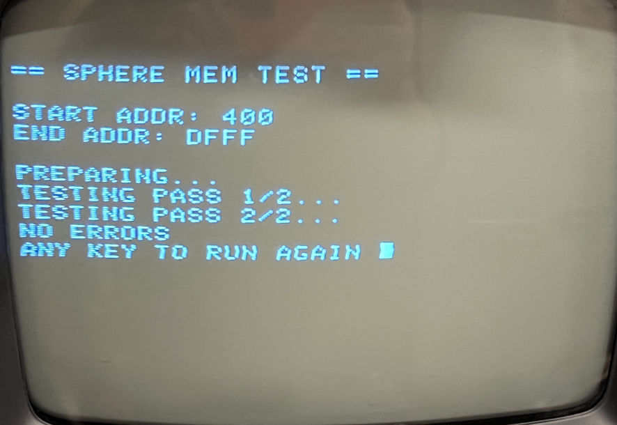
Not all Sphere customers had the enclosure with built-in CRT but those who did were invariably looking at a 9" monochrome, white phosphor CRT display, gently dimmed through bronze-smoked acrylic, their own faces reflected in the plastic. The display hardware had design issues; the text appeared in a gently waving form that also had "snow" artifacts flickering on it. Today this feels warm, and human, to modern eyes.
A Technical Aesthetic
Customers without a "full" enclosure spent a lot of time looking at the printed circuit board module (or modules) that they did have. The look of these physical components was in some ways more interesting than the anonymous metal case was.
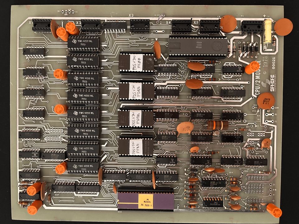
Each of the Sphere boards was 8"x10" in dimension. That's a standard size for a book or photograph, maybe, but not really for computer boards which have traditionally been more horizontal in aspect. Organic clutches of large ceramic disc capacitors are typical of the era, but the bright orange cylindrical electrolytic parts add a jaunty pop of color.
To my eye, boards like the one shown above look like a trendy 1970s kitchen. The whole palette is there: from the avocado of the fiberglass substrate, to the cocoa and orange of the capacitors and old-style resistors, to the harvest gold on the CPU chip cap. The chrome-like trace lines tie it all together. Yet it barely qualifies as a "designed object" (it is unquestionably a pretty normie circuit board of the era).
The Sphere modules did not have edge connectors or even standard IDC connectors on them, so each board seemed like a self-contained unit.
The lack of standard connectors was due to a reliance on nonstandard ones. Across the top of every Sphere board runs a row of 14-pin sockets, designed to hold integrated circuit chips, but repurposed here as an inexpensive interconnect scheme. A series of ribbon cables links together components in the system: four cables are the minimum, carrying the system bus and the power connections.
The result was circuit boards distinct in appearance when seen by themselves but obscured by a swirl of fragile wiring when assembled into a system. "The mechanism under the lid wasn't pretty — not even to a hobbyist," lamented Paul Frieberger of the Sphere in 1984's Fire in the Valley.

Finally, there is a prominent component that we don't see. The external "power supply unit" was a large, unsexy box strategically omitted from all marketing and sales photography. If you thought Apple's recent Vision Pro battery pack was aesthetically controversial, check this out:
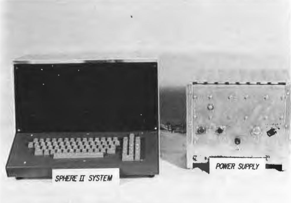
It was apparently extremely heavy (containing not one, not two, but three! transformers). The PSU was likely an off-the-shelf design from (or a collaboration with) a local electronics outfitter. You'd probably keep it on the floor under your desk; most customers replaced it with something else or did substantial DIY upgrades.
The Quiet Sphere
I love visual language for its own sake, but does it matter? So much of our feelings about using technology come subconsciously from how we interact with it, and how it fits into our lives and our offices and homes (or doesn't fit: one Sphere customer traveled in person to the factory location to purchase spare paint so his power supply case could match the computer, in order to make his wife happier about the clunky beast in the office). Steve Jobs at Apple was famously fussy about product design, all the way back to the beige family-friendly 1977 Apple II. He understood the value of visual language in technology, but so did the designers of Digital Equipment Corporation's fabulous PDP minicomputers and warmly distinctive VT100 terminals (none of which were marketed to home users).
There seems no question that the technology has a starring role in photos like these:
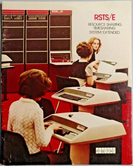
Even the carpet is color-coordinated! By contrast, here's an image from Sphere's marketing of the same era:
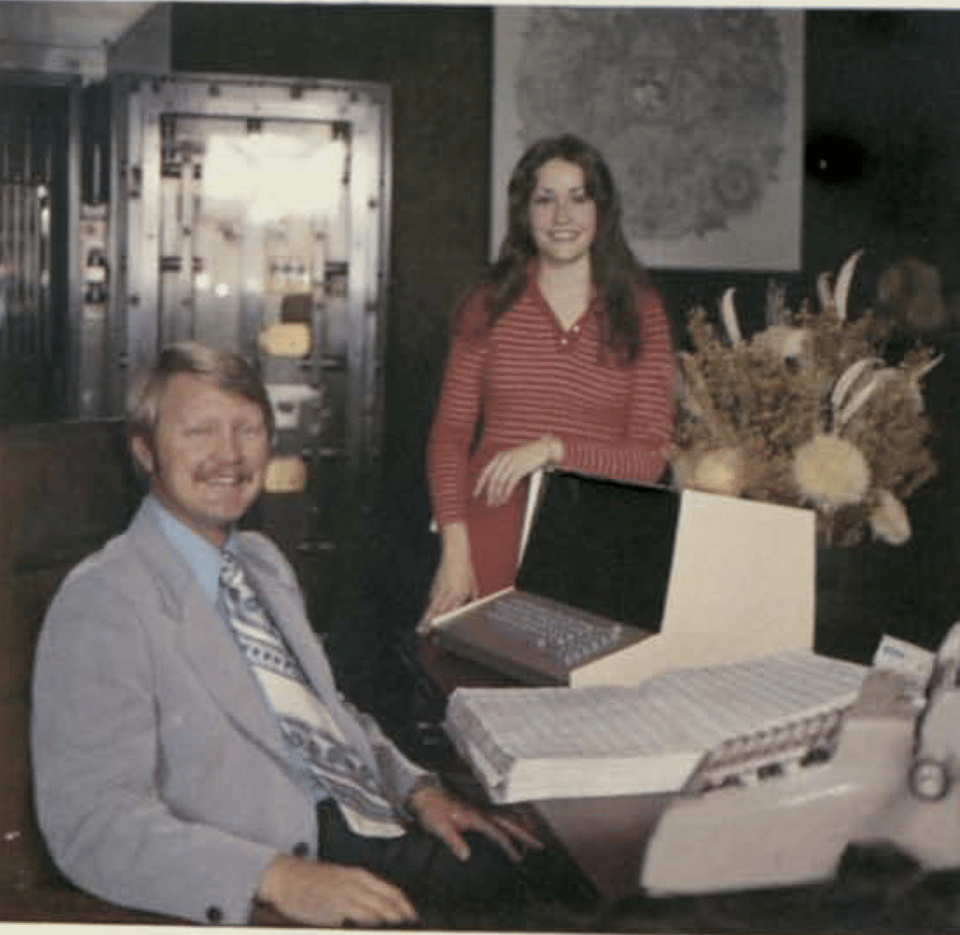
Here it's the people who have your attention. The computer is one of multiple desktop tools, alongside an adding machine (!). You're not in a spaceship, you're still in the bank. There's value in that, too, and in a sense this quietness may have been more forward looking to the future utility of microcomputers than it seems at first blush.
Sphere's undoing was ultimately financial of course, not aesthetic—and many relatively nondescript technology products are wildly successful. I do wonder whether the Sphere computers might have grabbed your attention just a bit more directly if they had put that logo on the front of the thing.
Typographer's Corner
I moonlight as an occasional type designer, so I love an excuse to talk about fonts.
The "Program" (aka "Tuxedo") typeface that appears in both Sphere and Altair branding was digitized in 2009 as DXS Tuxedo Regular (from the Dan Solo source). Despite the rage for “computer” style fonts in the 1970s into the 1980s, “Program” was not one that stood the test of time. The Formatt graphic design aid shop appears to have been the only commercial source for this font, after which it didn't seem to see much use. “Countdown” and “Data 70,” less legible and less playful, remain go-to stylized tech typefaces.
If you are curious about Letraset-style "dry transfer" lettering of the pre-desktop-publishing era, Dan Rhatigan maintains LetraSlut, a fantastic wiki hosting images of many of the typefaces the company used to offer (and he also sells unused vintage sheets in his adjacent LetraShop).
New York-based Photo Lettering Inc. once published an amazing one-liner catalog of styles that included many spectacular designs popular in the 60s and 70s. (I love that era of photo type).
Outside of the specifics of Sphere, if you're interested in bitmap typography and other display technologies, I did a talk last year about the history of computer typography through San Francisco's Letterform Archive.
You can always reach me at bzotto@gmail.com. The main site for this project is at https://sphere.computer. All text is copyrighted by Ben Zotto.